


Stopping by Typography
Whether you are a professional designer or not even close to, you always want your visual to be a piece of art. But also understandable, convincing, empathic, trustful, and modern as well, so you can ensure your creation reaches the audience.
Apart from art, design follows a suite of laws and rules, based on the heuristics of pragmatic production and problem-solving. As much as composition and color, typography says a lot about your business. It’s all about combining a perfect set of fonts to let your audience effectively percept the info you want them to.
Hierarchy
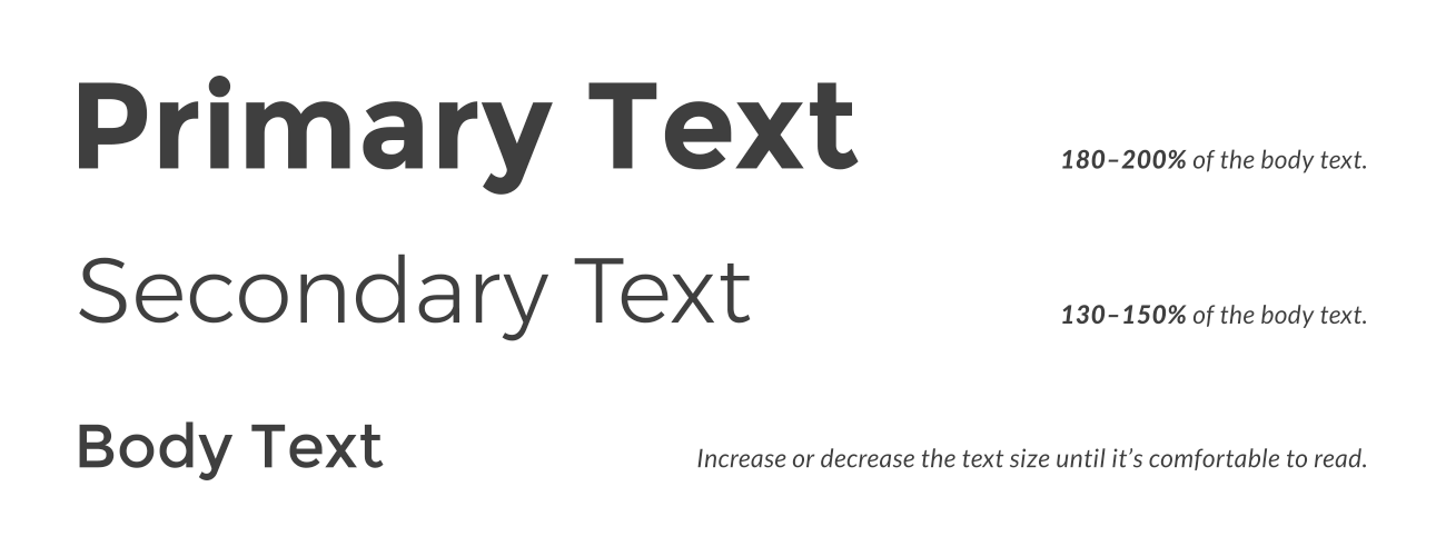
Finding the right hierarchy for the text being laid out is important in creating not only an interesting and visually appealing layout, but also helps the viewer digest the information being presented in smaller, easily understood pieces.
This goes back to helping the viewer understand the information by drawing them in with an interesting composition, then walking them through the text in order of importance. Before getting to refine your text, type all headings in the same style and choose which of them deserves more attention. That word or sentence should be the Papa on your image.
Getting it simple – try using same font sizes in Primary and Secondary texts as rarely as possible.
Diversity
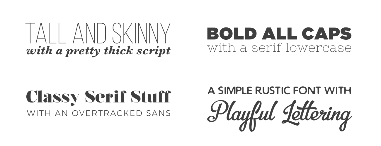
Opposites attract! The Primary text is big and “in your face”. That is one part of the text to get the most attention. Nevertheless, don’t necessarily make it bold or black – sometimes a light-weight typeface fits best. Font selection is a critical part of putting together an interesting type layout. Different styles of fonts can evoke particular emotions and refer to time periods, cultures and even specific parts of the world.
To sum it up: Always use several fonts, but less than 3. Popular and working combos are Sans / Serif, Condensed / Script. Your Primary and Secondary texts could be of the same typeface, but make them Bold and Light, or at least Regular and Italic, to establish a visual difference.
Building up your personal typeface experience, eventually, you’ll get a professional designer’s feel about how it works. Whenever you dive in typography, remember – keep it simple. That is the fastest and most effective way to make a design work for your goals.
Choose what describes your business best:
What do I choose?
Enterprise: for multi-location and direct selling brands. Manage thousands of social media pages of your local distributors, partners, or franchisees.
Agency: for marketing agencies. Manage all your clients’ social media pages on one platform.
